Increasing subscription revenue with design solutions
︎ My role: Product Designer, Project Manager
︎ Time: Aug 2019 — Apr 2021 (8 months)
︎ Team: 3 full-stack developers, CTO, CEO, customer success team, financial content analyst
Mitre Media is a fintech start up company (small team of ~15 people) with a vision of helping people become better self-directed investors. The products we have includes premium financial media brands which are Dividend.com, Mutualfunds.com, MuncipalBonds.com, and Propelor.
We run on subscription business model (B2C) and also have ad clients where we host their ads on our websites (B2B).
We run on subscription business model (B2C) and also have ad clients where we host their ads on our websites (B2B).
From discovery to deliver, I am involved in the entire project life cycle as a product designer and a product manager.
My role as a product manager
In the beginning of 2020, I took on the role as a product manager as well as being a designer. My role as a product manager included:
- Analyze Google Analytics data to understand user behaviours and most used/active features on the website
- Identify opportunities where design improvement can create business value and discuss what feature to work on on the roadmap
- Defining business logic and mapping of the user flows for the dev team
- Unblocking and managing the dev team and make sure that the project meets the deadline, making sure that any risks or rabbit holes are communicated to the stakeholder, prioritizing and cutting out scope if necessary
- QA and testing, management of backlog. Responsible for quality release of product features, usability and performance
My role as a product designer
- Drive design process and decisions in coordination with the rest of our team of developers, financial content analysts and other stakeholders
- Combine both quantitative (metrics) and qualitative (user feedback) data to evolve designs that meet Mitre’s business objectives
- Use wireframes, storyboards, prototypes, and other methods to communicate my design concepts with the team
- Ensure a seamless user experience across multiple channels (web, mobile, email)
- Conduct user research, interviews, and develop user personas
See the Final Designs below ︎︎︎︎︎︎︎︎︎
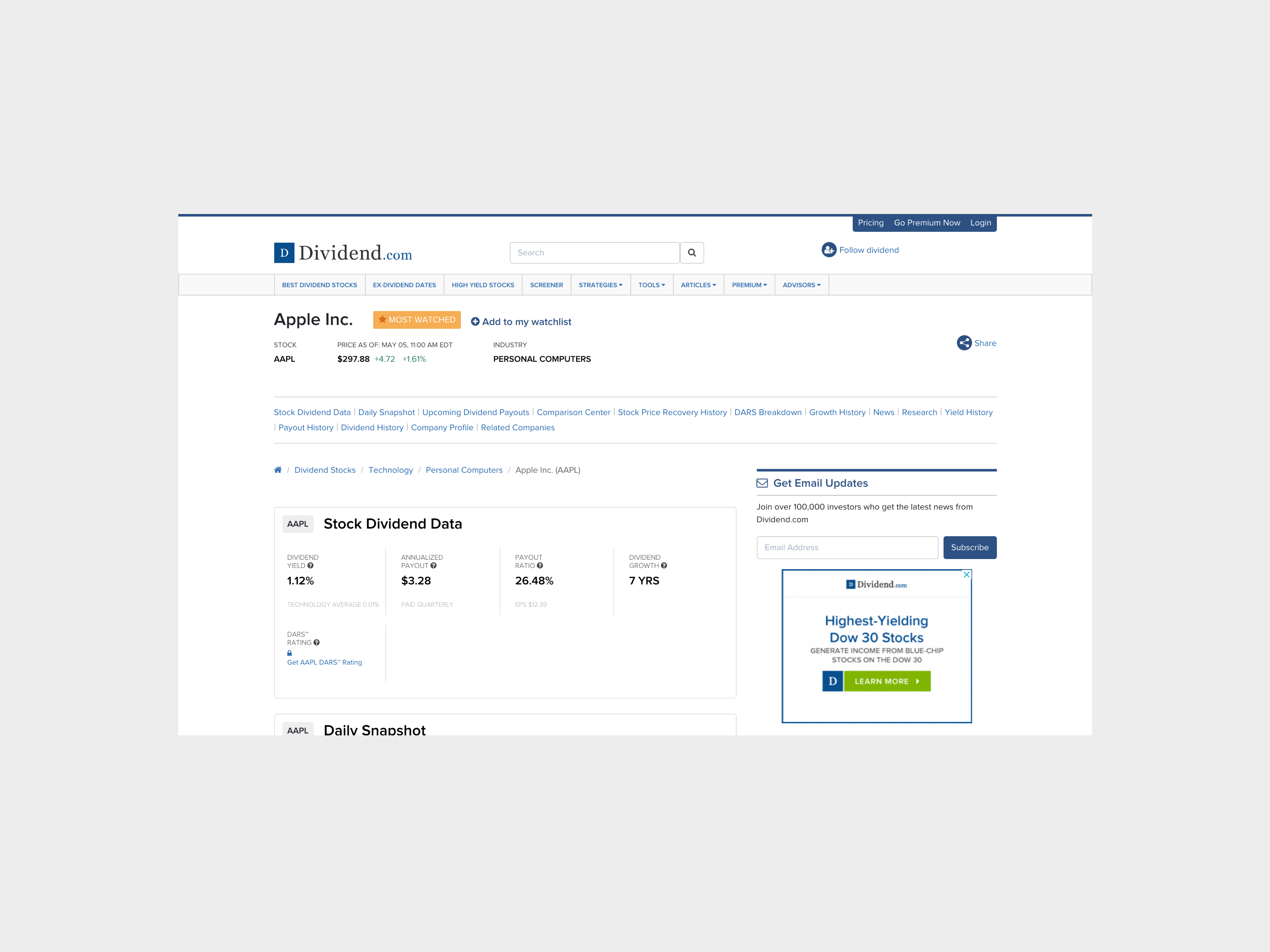
Before: Ticker page — Web
![]()
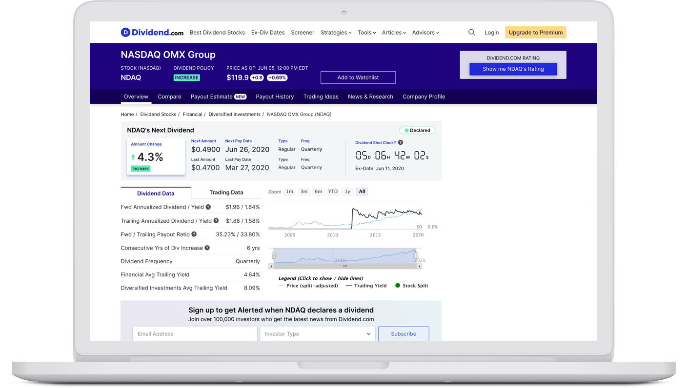
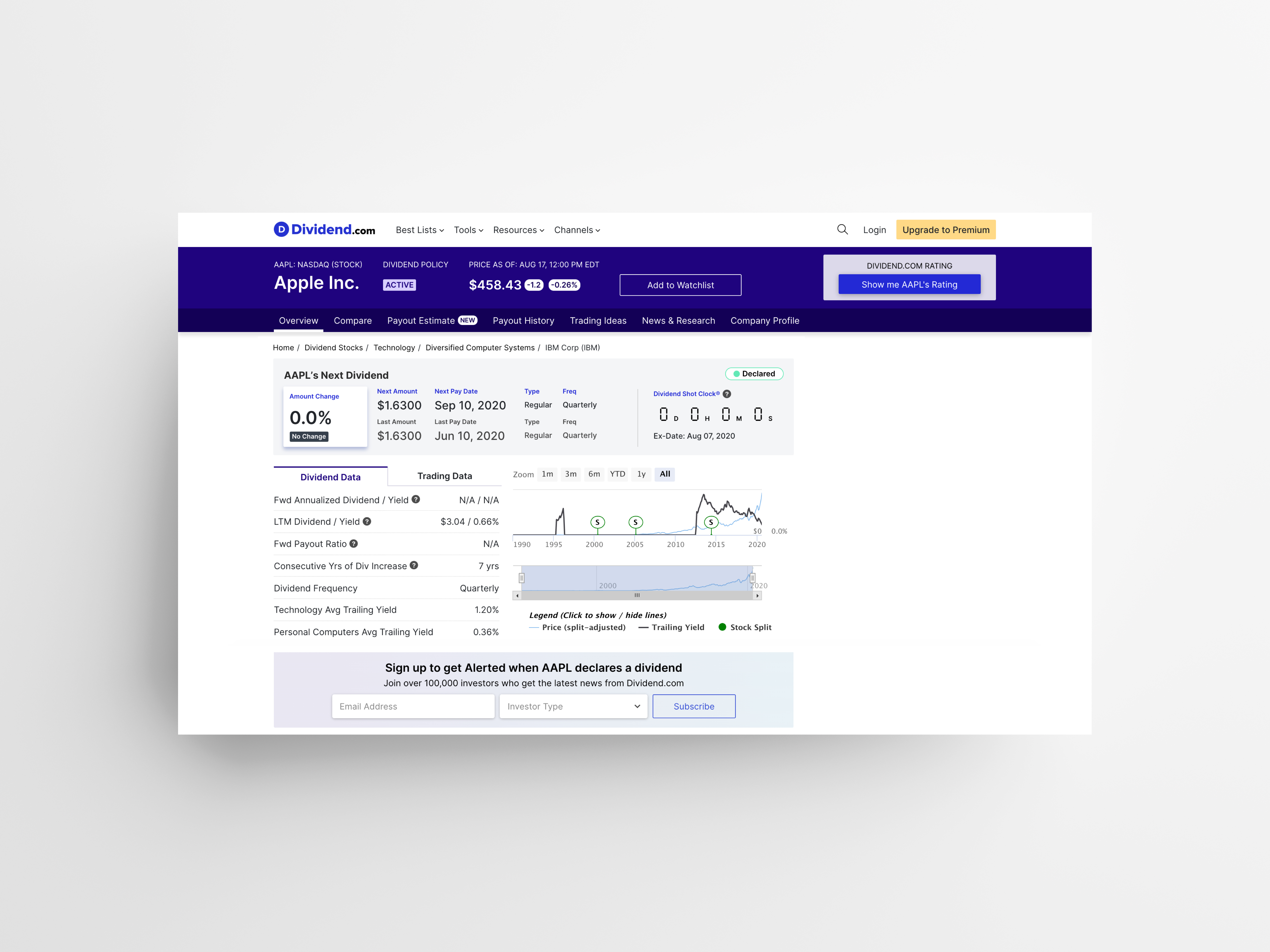
After: Ticker page — Web
![]()
User can reveal Dividend.com rating and payout estimate (premium features) 2 credits per month. This allows users to learn more about our premium values while encouraging users to revisit our website every month.
User can reveal Dividend.com rating and payout estimate (premium features) 2 credits per month. This allows users to learn more about our premium values while encouraging users to revisit our website every month.
Before: Ticker page — Comparison Center UI Web
![]()
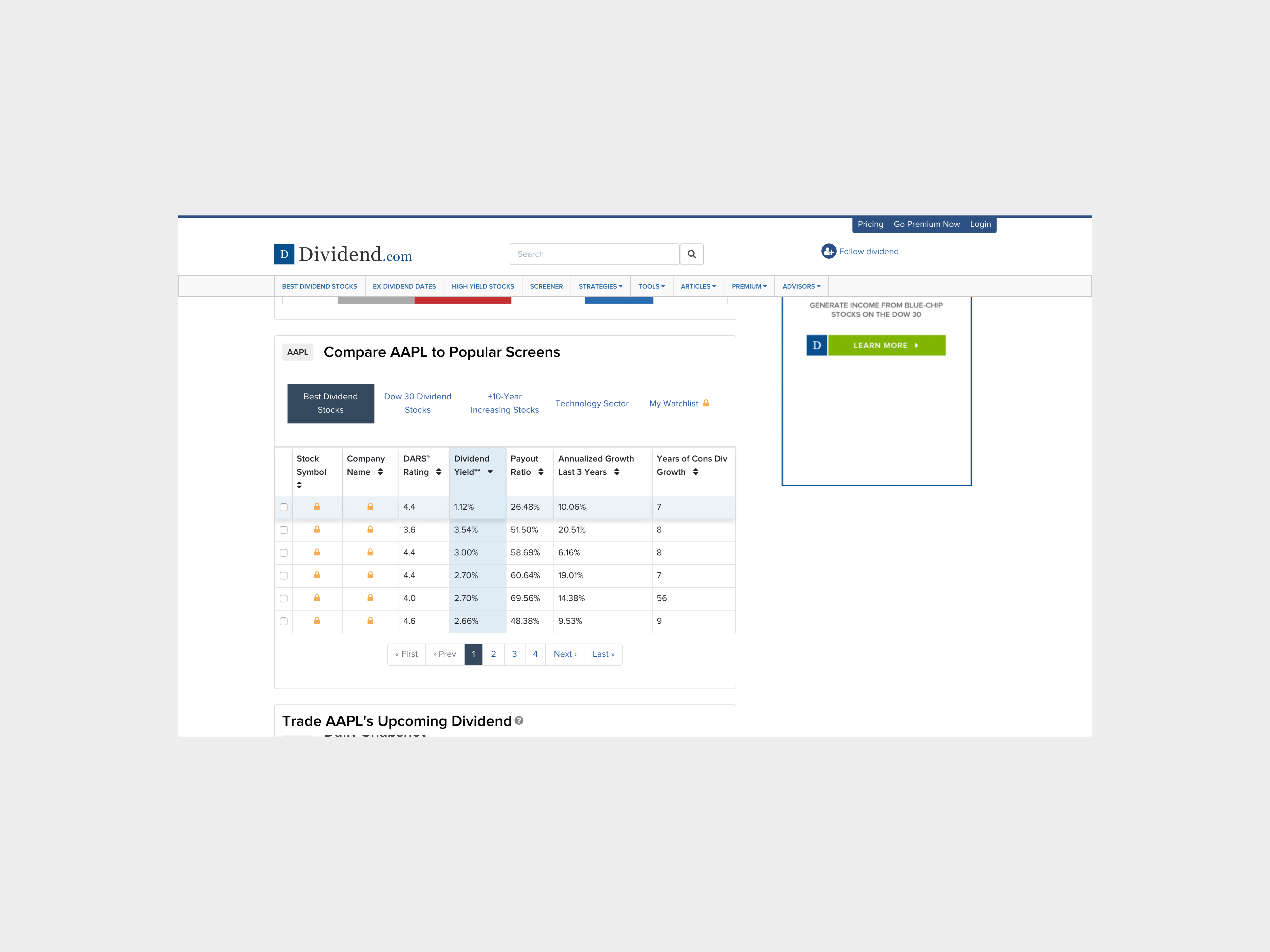
After: Ticker page — Comparison Center UI Web
![]()
Previously, we had lock icons to hide premium content but I changed it to a crown icon. I wanted to use iconography that can bring more positive feeling being a premium member rather while locks made it feel unwelcoming.
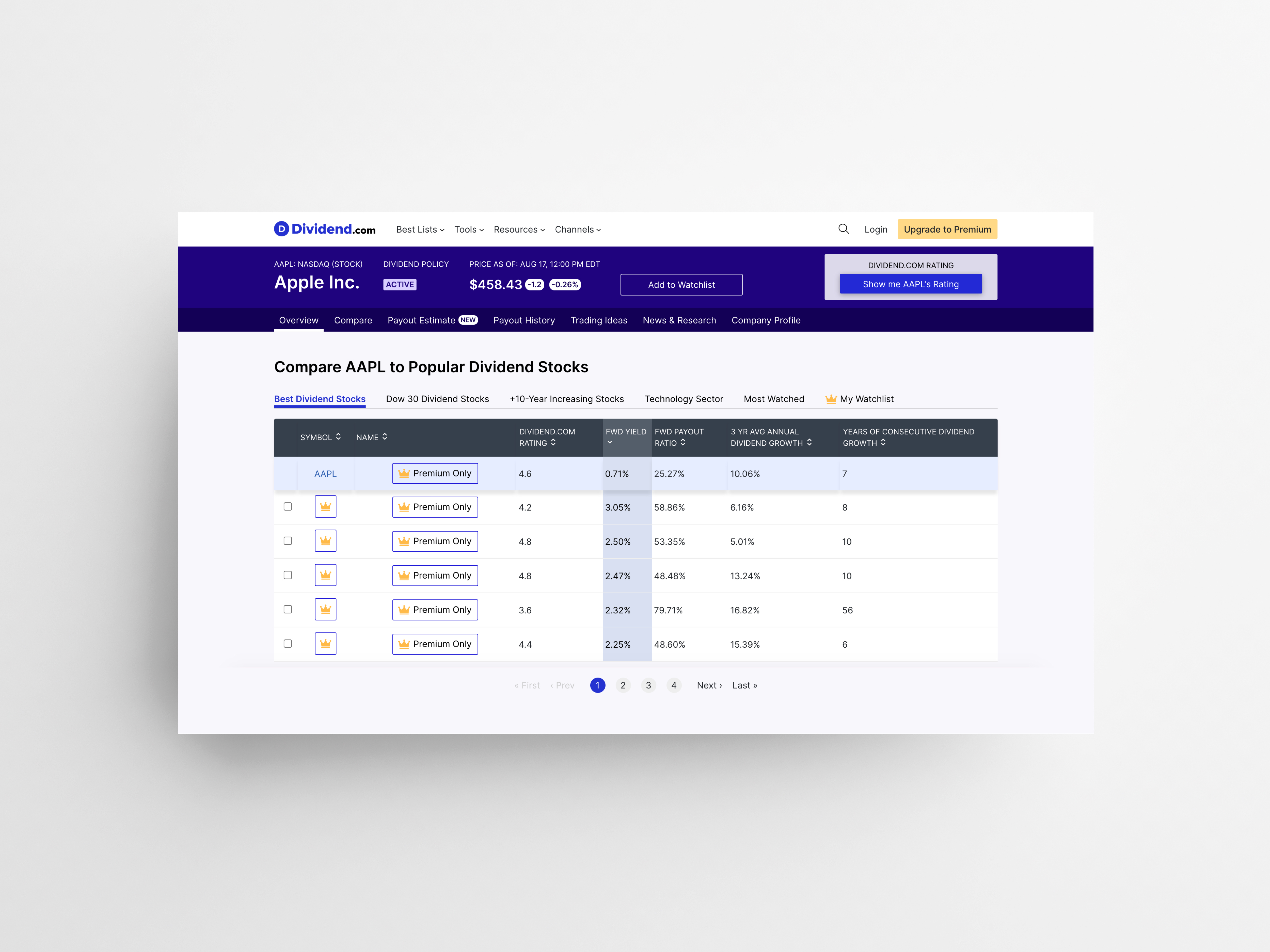
Previously, we had lock icons to hide premium content but I changed it to a crown icon. I wanted to use iconography that can bring more positive feeling being a premium member rather while locks made it feel unwelcoming.
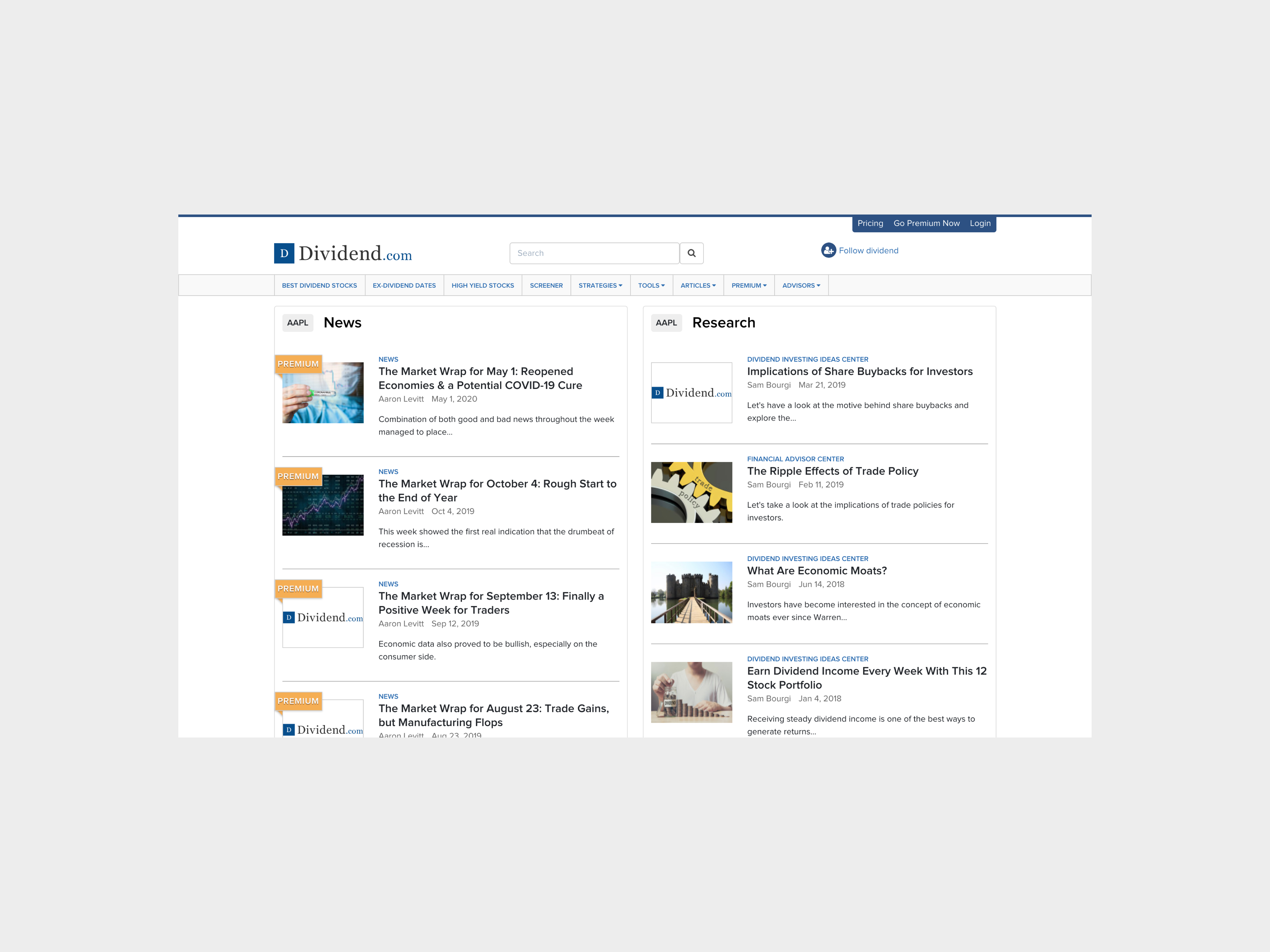
Before: Ticker page — News and Research Web
![]()
After: Ticker page — News and Research Web
![]()
Changed the layout for easier readability and separating the News and Research components horizontally rather than vertical columns.
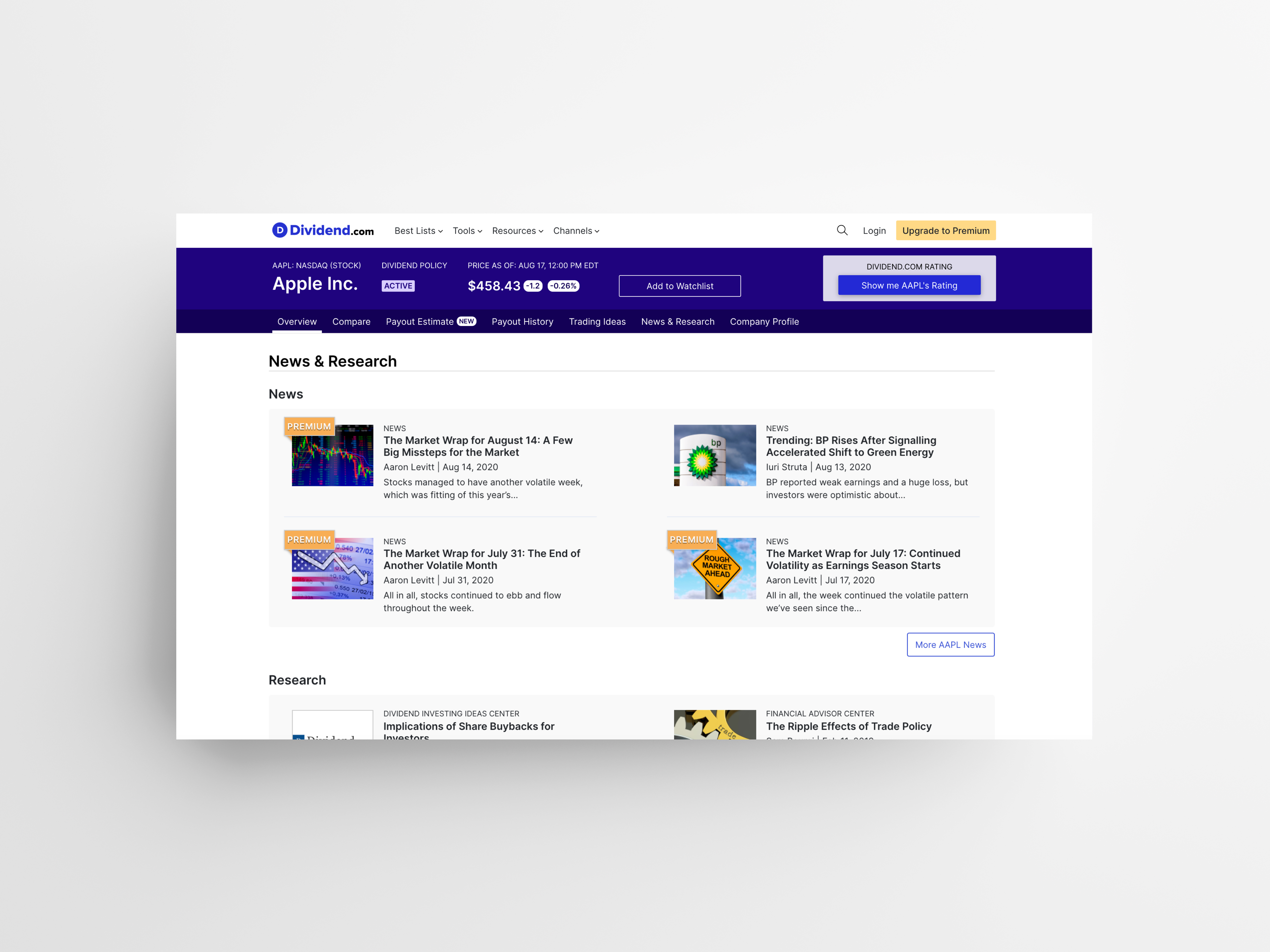
Changed the layout for easier readability and separating the News and Research components horizontally rather than vertical columns.
Before: Ticker page — Tablet
![]()

After: Ticker page — Tablet
![]()
I noticed that we had a lot of tabs in the sub-navigation (refer to the image on left under the title “Apple”). The ticker page was very long making it hard to navigate. There were a lot of repeated information scattered around on the page. I suggested to the stakeholder that we reorganize the information so that it is concise. We went from 15 tabs to 7 tabs.
I noticed that we had a lot of tabs in the sub-navigation (refer to the image on left under the title “Apple”). The ticker page was very long making it hard to navigate. There were a lot of repeated information scattered around on the page. I suggested to the stakeholder that we reorganize the information so that it is concise. We went from 15 tabs to 7 tabs.
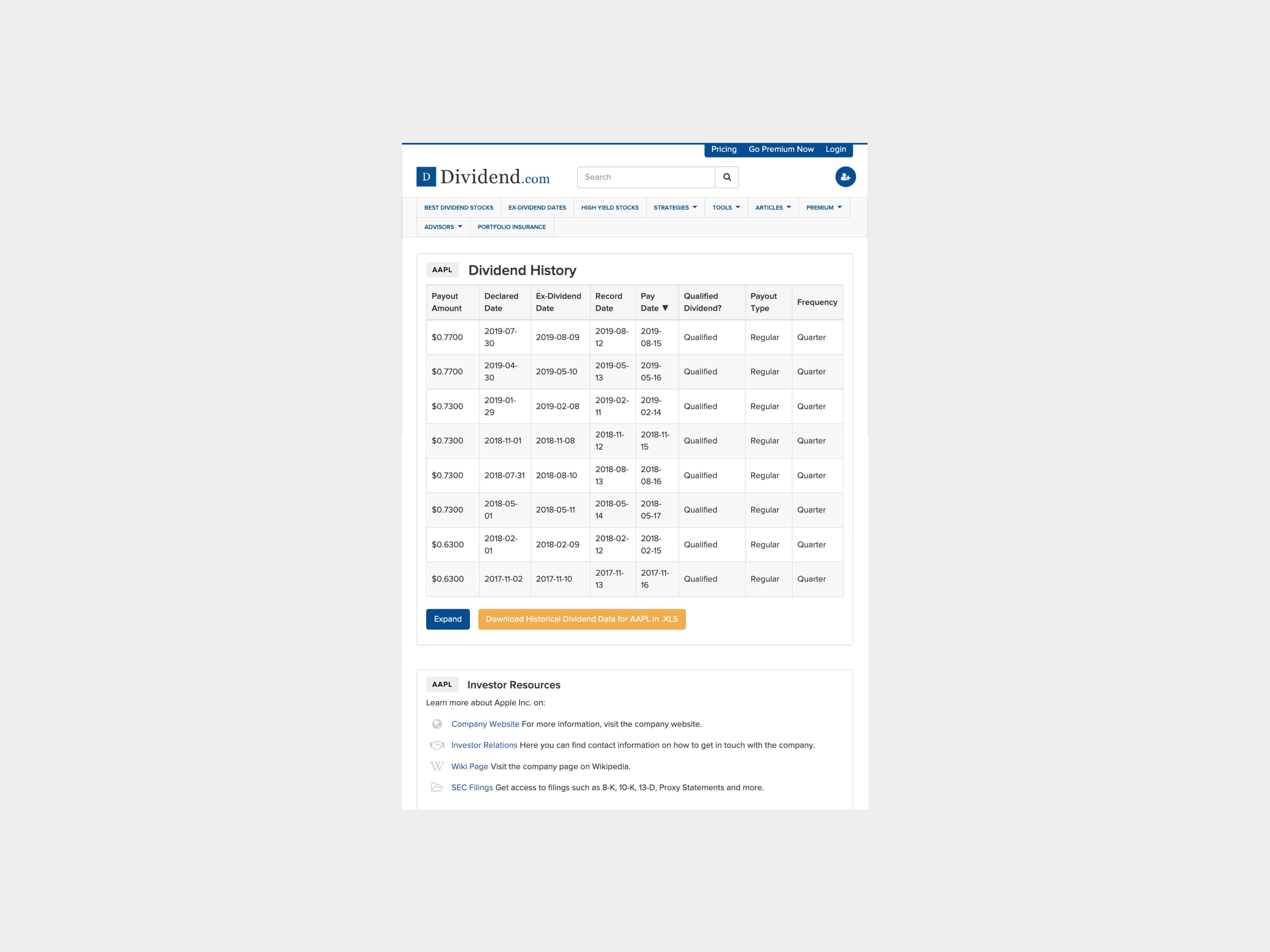
Before: Ticker page — Dividend History Tablet
![]()
After: Ticker page — Dividend History Tablet
![]()
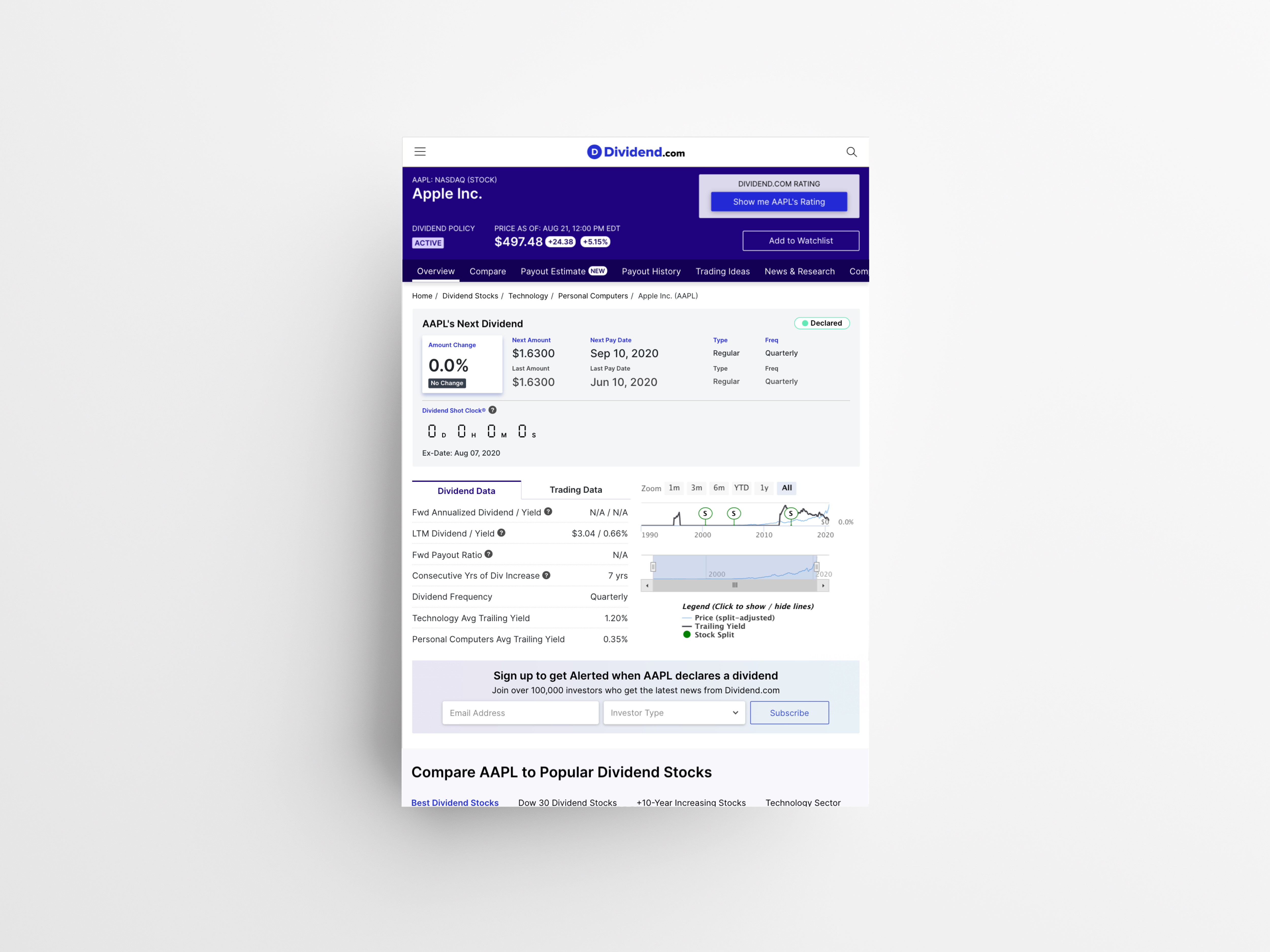
While we want to give our user, individual investors, as many information we can to fit their need, it was important to find the right balance to display how much data on page load. Previously, when user clicks on “expand” button for the table, the table would show all dividend history which could be 100+ rows. Instead, we created a popup dedicated for seeing all dividend history so that user can have more control when reviewing the information.
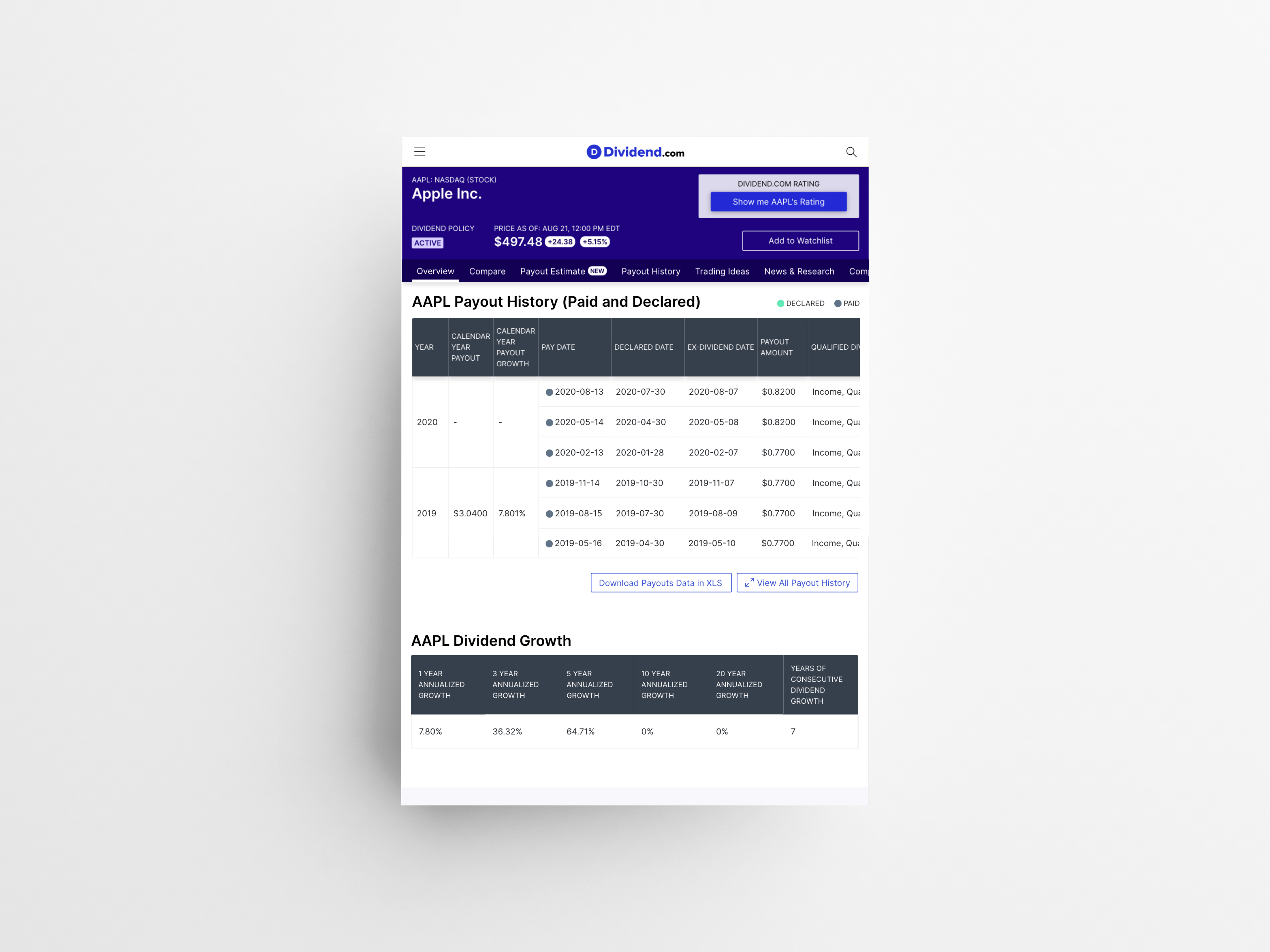
While we want to give our user, individual investors, as many information we can to fit their need, it was important to find the right balance to display how much data on page load. Previously, when user clicks on “expand” button for the table, the table would show all dividend history which could be 100+ rows. Instead, we created a popup dedicated for seeing all dividend history so that user can have more control when reviewing the information.
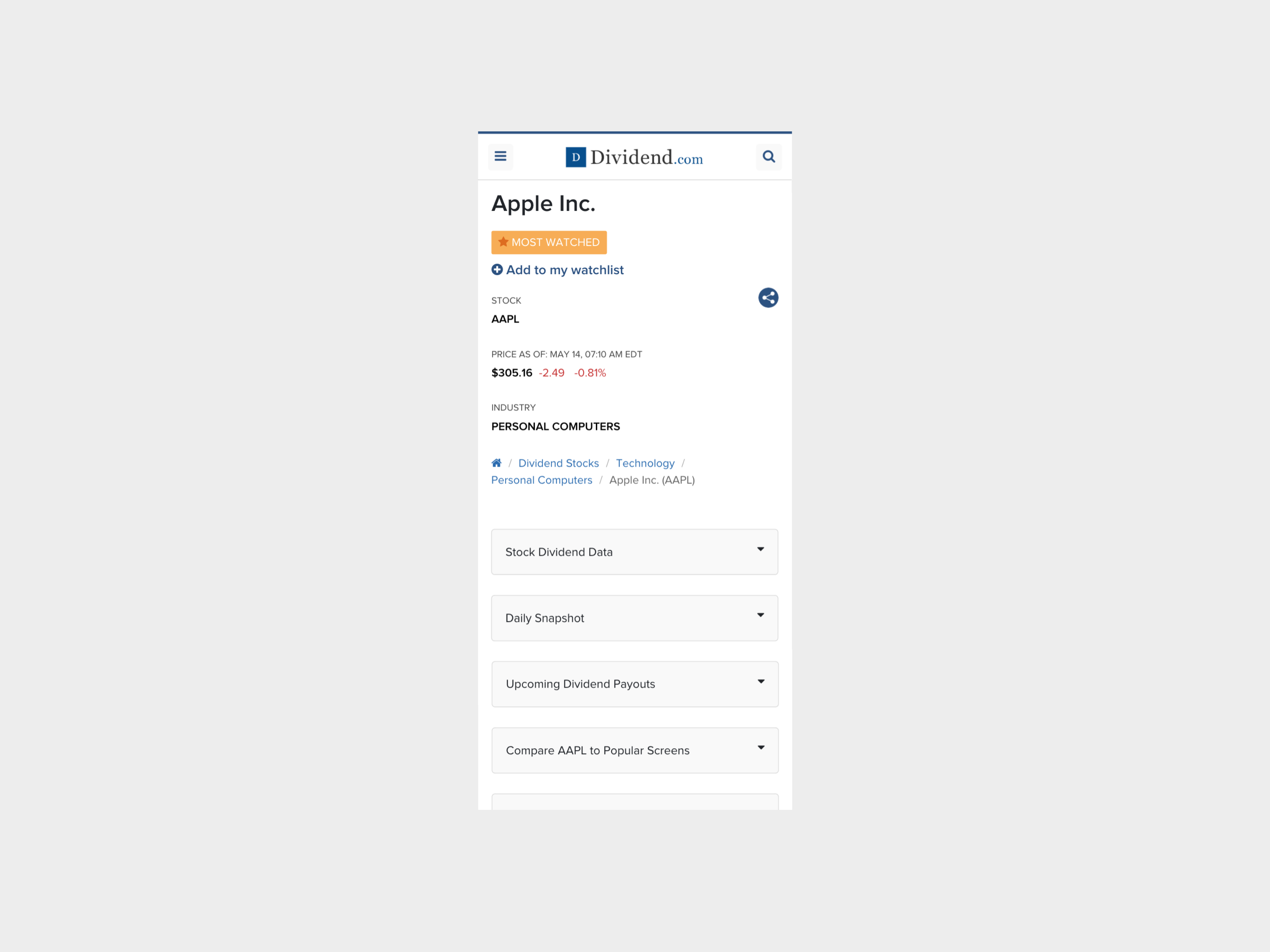
Before: Ticker page — Mobile
![]()
After: Ticker page — Mobile, Payout estimate feature
![]()
Here you can see what a public user would see when they come across our a premium feature, Payout Estimate. To merchandise our premium feature better, instead of having the tabs collapsed by default, we purposely have the “Overview” section expanded for easier discovery.
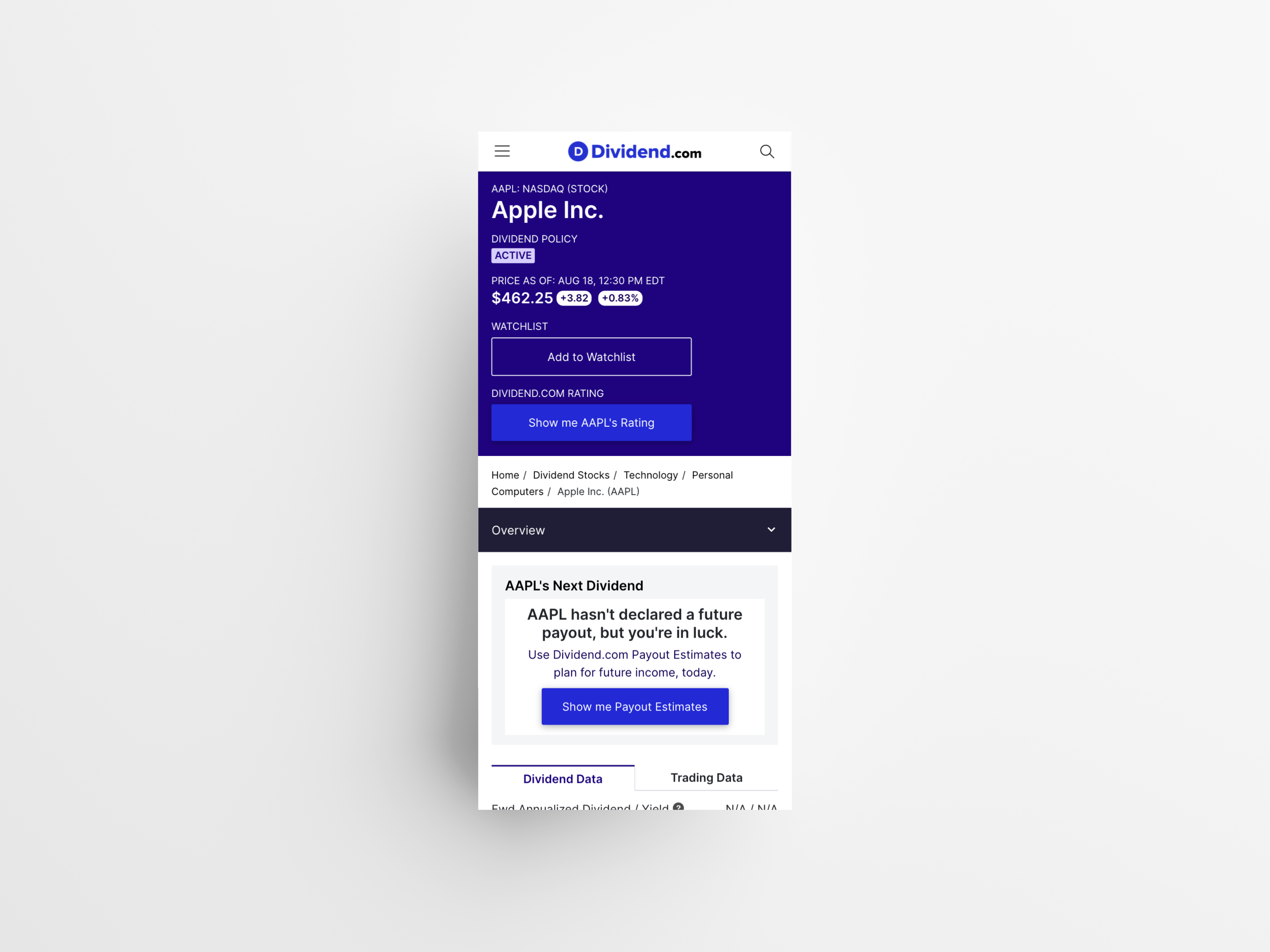
Here you can see what a public user would see when they come across our a premium feature, Payout Estimate. To merchandise our premium feature better, instead of having the tabs collapsed by default, we purposely have the “Overview” section expanded for easier discovery.
Before: Dividend history section on Ticker page — Mobile
![]()
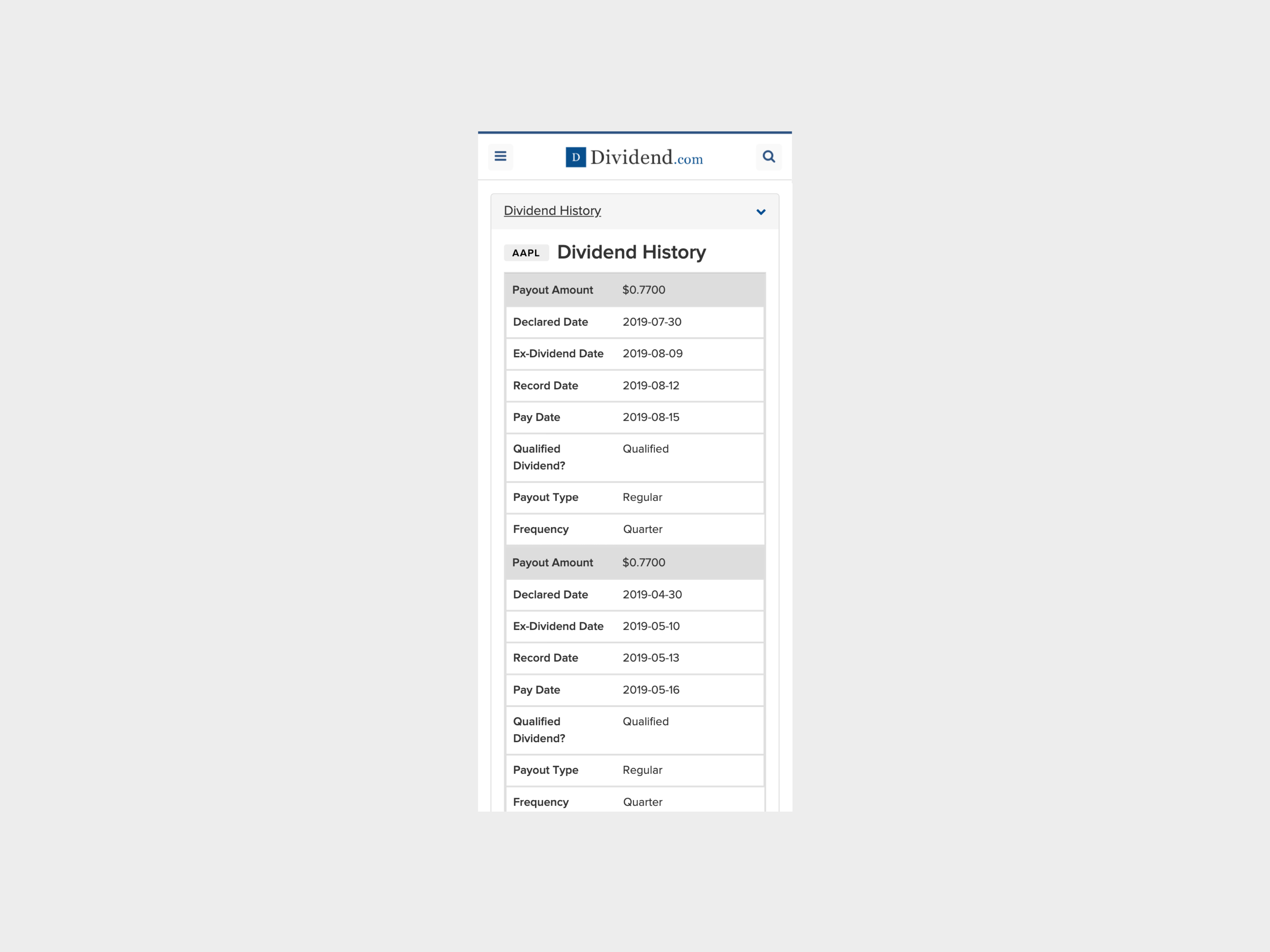
After: Dividend history section on Ticker page — Mobile
![]()
In the previous design, the tables changed to cards UI on mobile. This made the mobile page to be extremely long which was challenging to get to the next content. It also created more likelihood of increasing user drop-off rate. Instead of card UI, I kept the table to be horizontally scrollable so the table remains short in vertical height but user can still view the details on the table.

In the previous design, the tables changed to cards UI on mobile. This made the mobile page to be extremely long which was challenging to get to the next content. It also created more likelihood of increasing user drop-off rate. Instead of card UI, I kept the table to be horizontally scrollable so the table remains short in vertical height but user can still view the details on the table.
Before: News and article section on Ticker page — Mobile
![]()

After: News and articles section on Ticker page — Mobile
![]()
I noticed that in the financial media space, the article thumbnail photos are not visually appealing. The photos were repetitive due to lack of imagery tied to finance. A lot of the photos were often random graphs, US flag, dollar bills or coins. Since we don’t have a dedicated designer curating and hand-picking the article thumbnail photos, I purposely made it smaller so that users can focus on the article titles when selecting what to read.
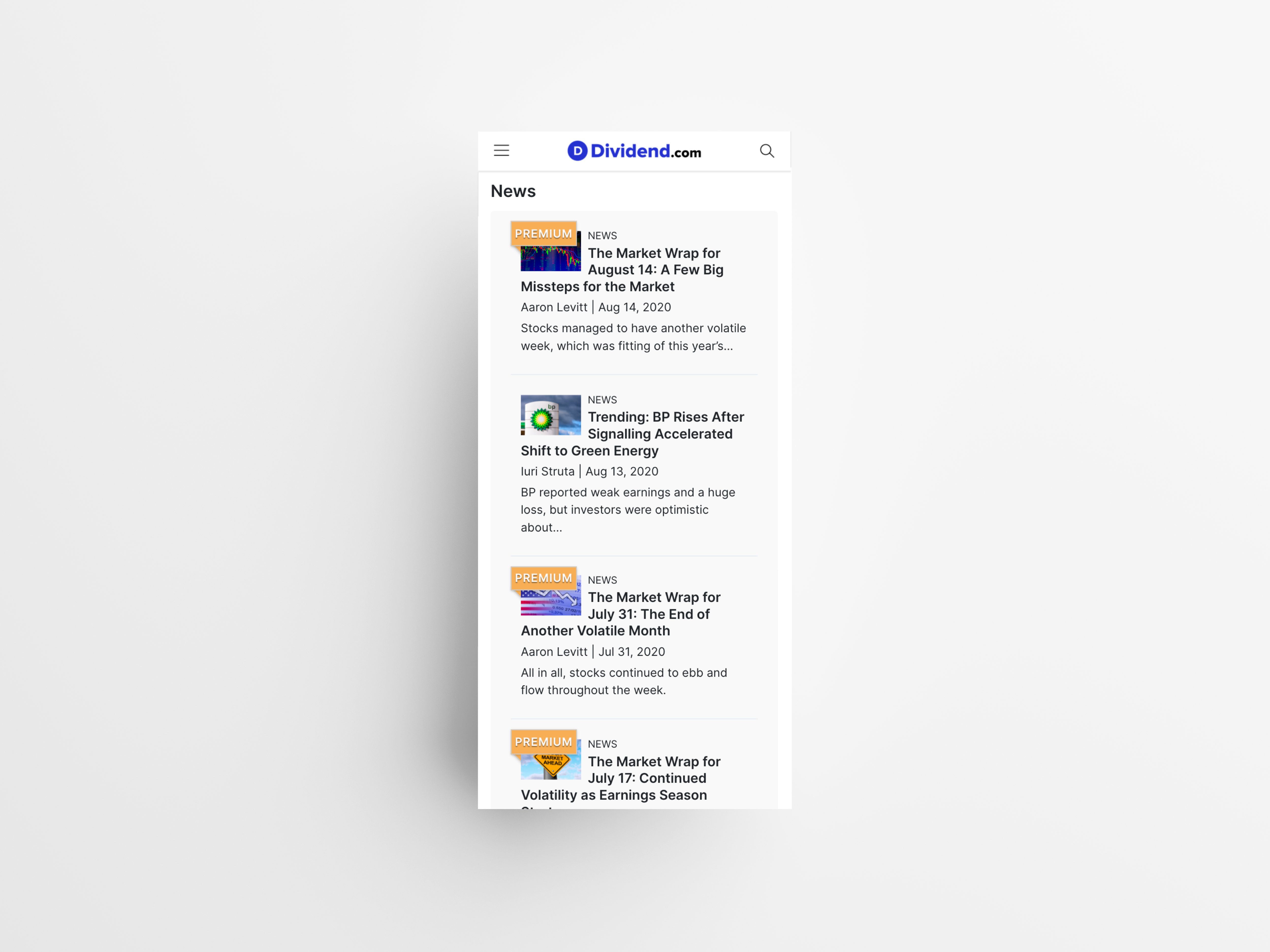
I noticed that in the financial media space, the article thumbnail photos are not visually appealing. The photos were repetitive due to lack of imagery tied to finance. A lot of the photos were often random graphs, US flag, dollar bills or coins. Since we don’t have a dedicated designer curating and hand-picking the article thumbnail photos, I purposely made it smaller so that users can focus on the article titles when selecting what to read.